A Brand That Moves
This webpage exists to explain the history of Programme, what we're trying to solve and what we stand for, while articulating the rationale behind each element of our brand identity system, composed of: logo, typography, composition, color and photography.
Reflecting on who we are
Programme is rooted in respect for the body and takes a holistic view on human health. We believe movement is a fundamental part of life, that's too often neglected and focused on how our bodies look rather than how they feel and perform. Programme offers practical, personal and sustainable training plans that help you create habits that respect the body and achieve life-long results, regardless of prior knowledge or experience.
Any meaningful brand tells a story that inspires. This requires an understanding of why we are here. Although our product exists on modern devices, our offering is access to what is already innately human — movement. Our brand will tell the story of movement to inspire our customers to move again, and our product will make movement accessible to many.
"Life is movement; it is it's very essence" - Aristotle
Where it started
Currently, the best step you can take to improve your physical health is to engage a personal trainer. With the ability to see to your lifestyle, personal trainers can create customised training plans to match it, all while adapting to your progressions and your equally important regressions. If you compared someone who works with a personal trainer, to your everyday workout class go-er, you'd see the value direction has on your training.
However, personal training doesn't come without it's fair share of problems, the common ones being high price-tags, dogmatic training styles, varying quality, and required localisation. When we began our work, we questioned what it would take to provide the same service at a more affordable price point, with accessible training styles, consistent high quality, and available from anywhere in the world. The only way to deliver something like this is with an intelligent system that could automate the entire decision stack of a personal trainer, inclusive of decisions made consciously based on logic and subconsciously based on intuition. And that's exactly what we're doing.
Programme as Name
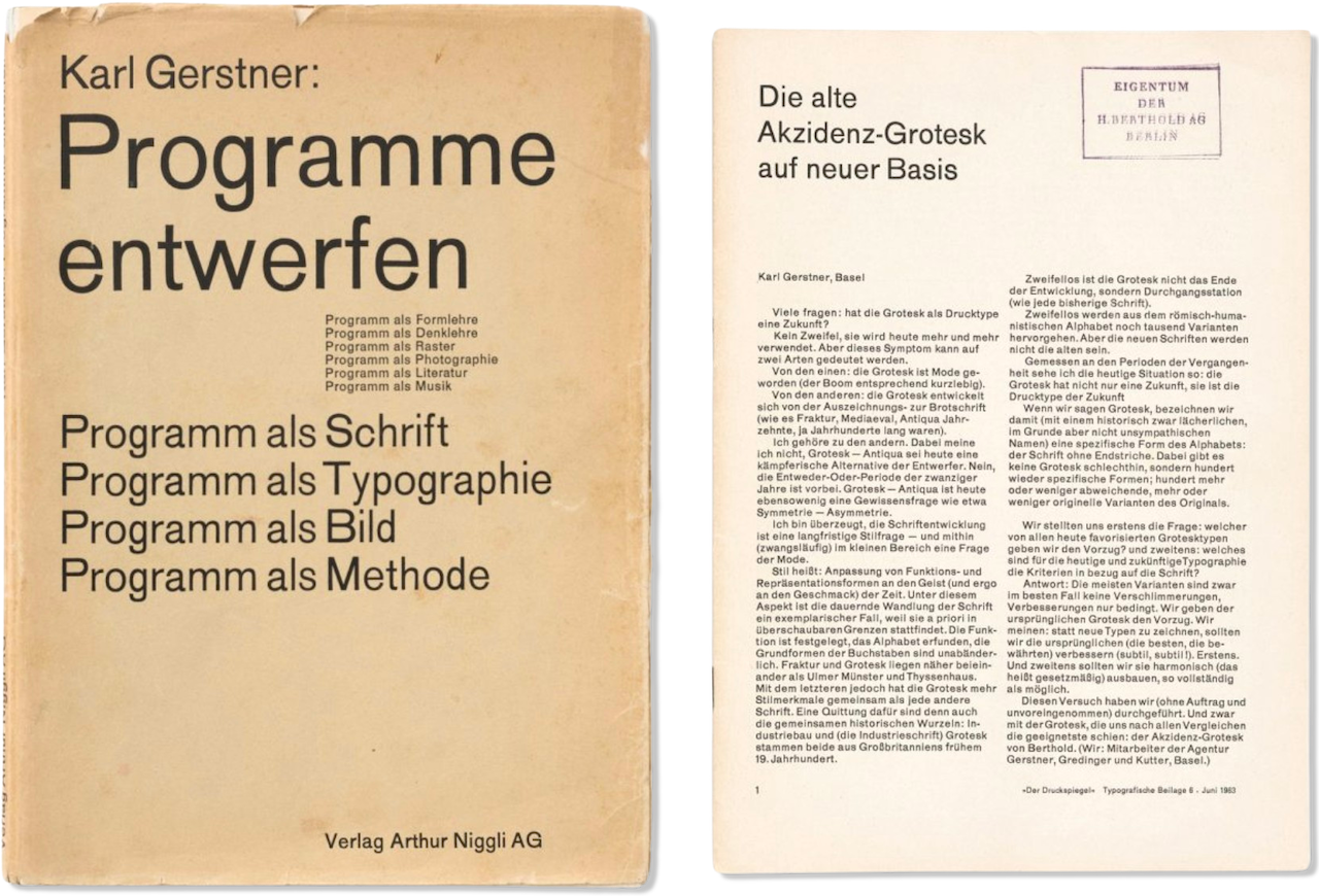
At this stage of our conception, I was reading the design classic Designing Programmes (Programme entwerfen) by Swiss designer Karl Gerstner. Now considered a central influence in computational design, this book provides an introduction to Gerstner’s design methodolgy that suggests using a rule based system to guide all design decisions of any given design product. The book showcases how the system could be applied across varying mediums from typography to architecture, whilst inspiring its integration into many more. Let’s run through it in 3 different contexts:
- If you were to design a font, instead of finding individual design solutions for each character, Gerstner suggests creating a design system that would create all the design solutions for each character in the font.
- As an architect, instead of designing each window of a building uniquely, use a rule based design system to approach every window.
- Or take me for example, designing an app's interface, instead of designing unique components for every screen of an app, create a design system that would become the framework for all screens and components.
The reason this resonates with us at Programme, is because it aligns so deeply with what we set out to solve. The fitness industry, especially in the digital context, is fixated on offering individual workouts offered through vast libraries with no system in place. No system means no context, no context means no direction, wether it's a typeface built from individual characters or a training plan built from individual workouts. This is the problem Gerstner set out to solve with his design approach and the exact approach we are taking to build a holistic system for your well-being.
Gerstner referred to these systems as programmes and proposed them as solutions. Not only did this approach become the solution to achieve our described goal, it also inspired our brand's name, Programme.
"Instead of solutions for problems, programmes for solutions" - Karl Gerstner, 1964
Designing Programmes and Gerstner’s approach became a key reference for our brand and design philosophy.
Typography
Having settled on our name, I now had to decide how to display it. The immediate connection was to work with Gerstner's typographic works, and more specifically his own implementation of the programmatic design approach discussed in Designing Programmes. He used this to create Gerstner-Programm when bringing Akzidenz Grotesk into the computational era, which at the time, stood beside Helvetica (known then as Neue Haas Grotesk) & Univers, the most prevalent san-serif typefaces of the 60's.
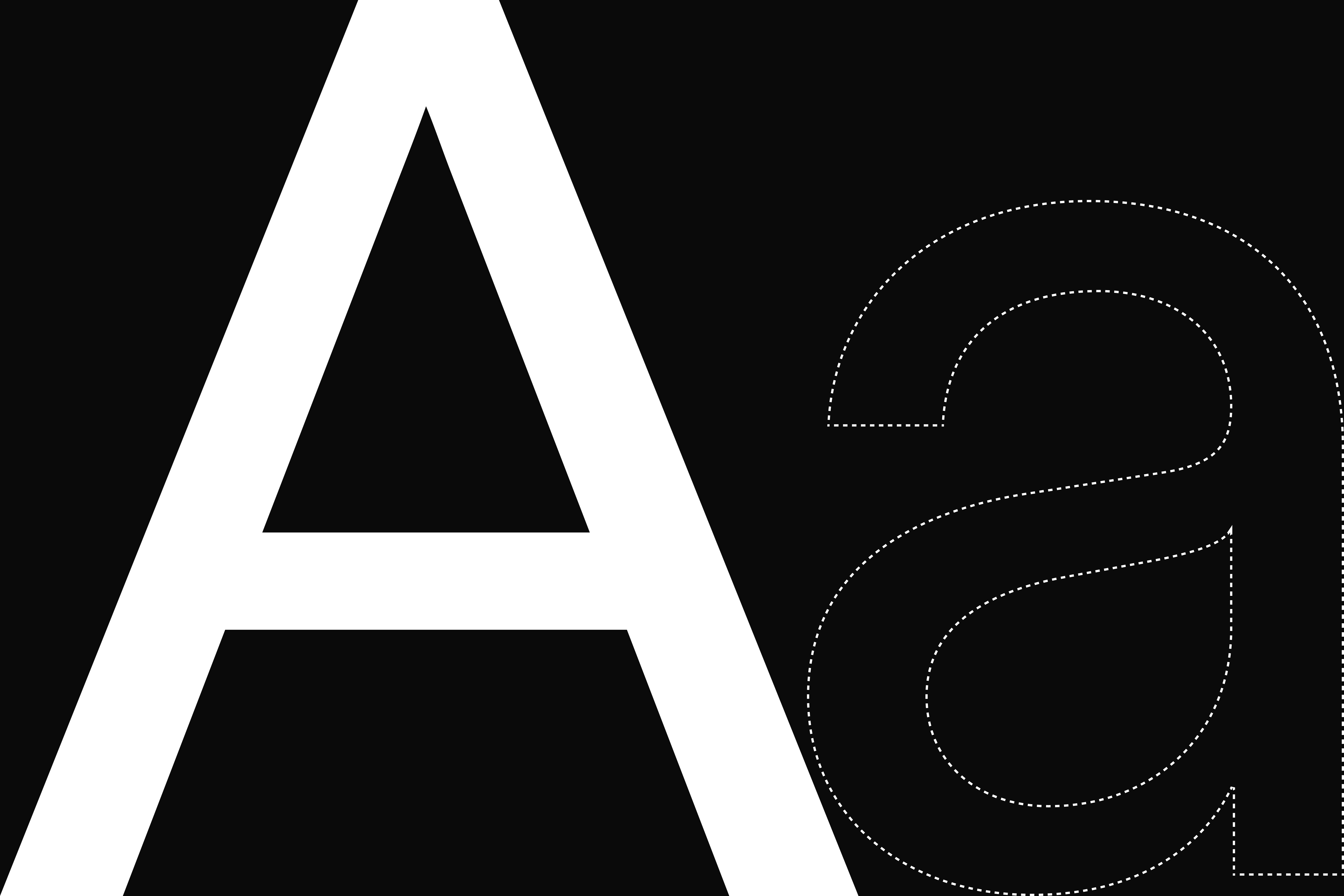
Gerstner believed in taking what came before him, re-interpreting it into his context, while subtly improving the original. Although Gerstner-Programm is not commercially available today, this same mentality was reciprocated by Swiss design firm & foundry, Dinamo, who took Gerstner-Programm and beautifully brought it into our modern world by improving it's readability on the digital screens we intend to use them on. Dinamo called this typeface Diatype, and it's our choice for our brand's typography & wordmark.
Dinamo introduced this font in multiple weights (including variable) and developed semi-mono + mono versions alike. Our selection of typefaces is simple, we took 2 weights of Diatype, regular and medium, and one weight of Diatype Mono, in regular. These selections create a contempary feel that visually articulate the programme we built our product upon.
Composition
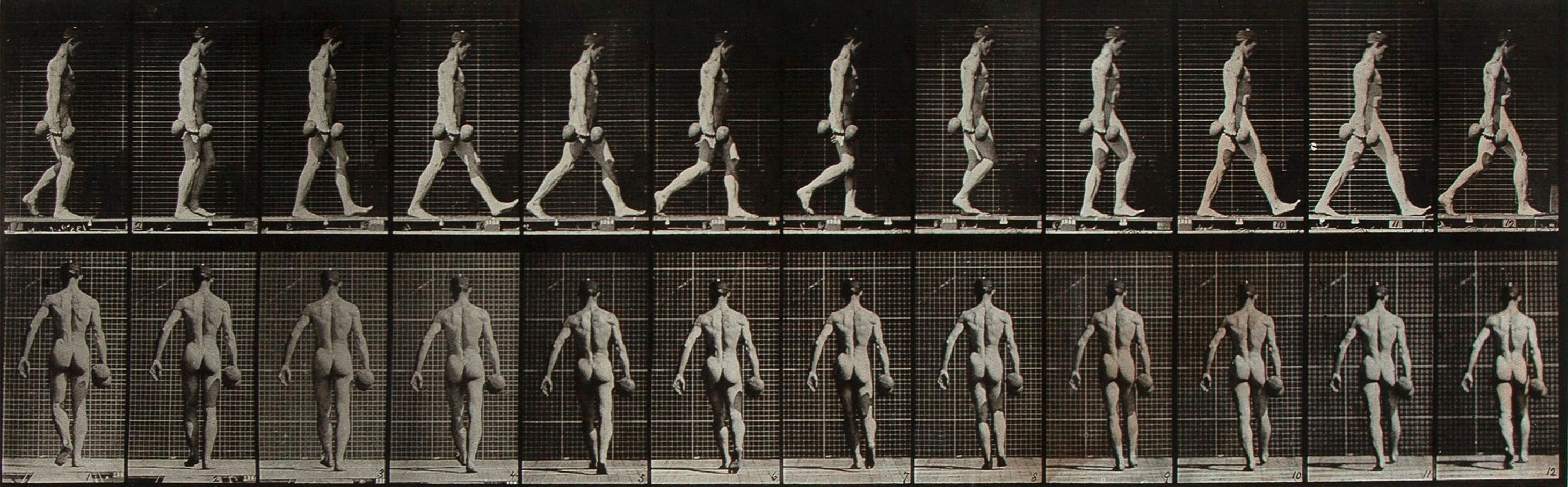
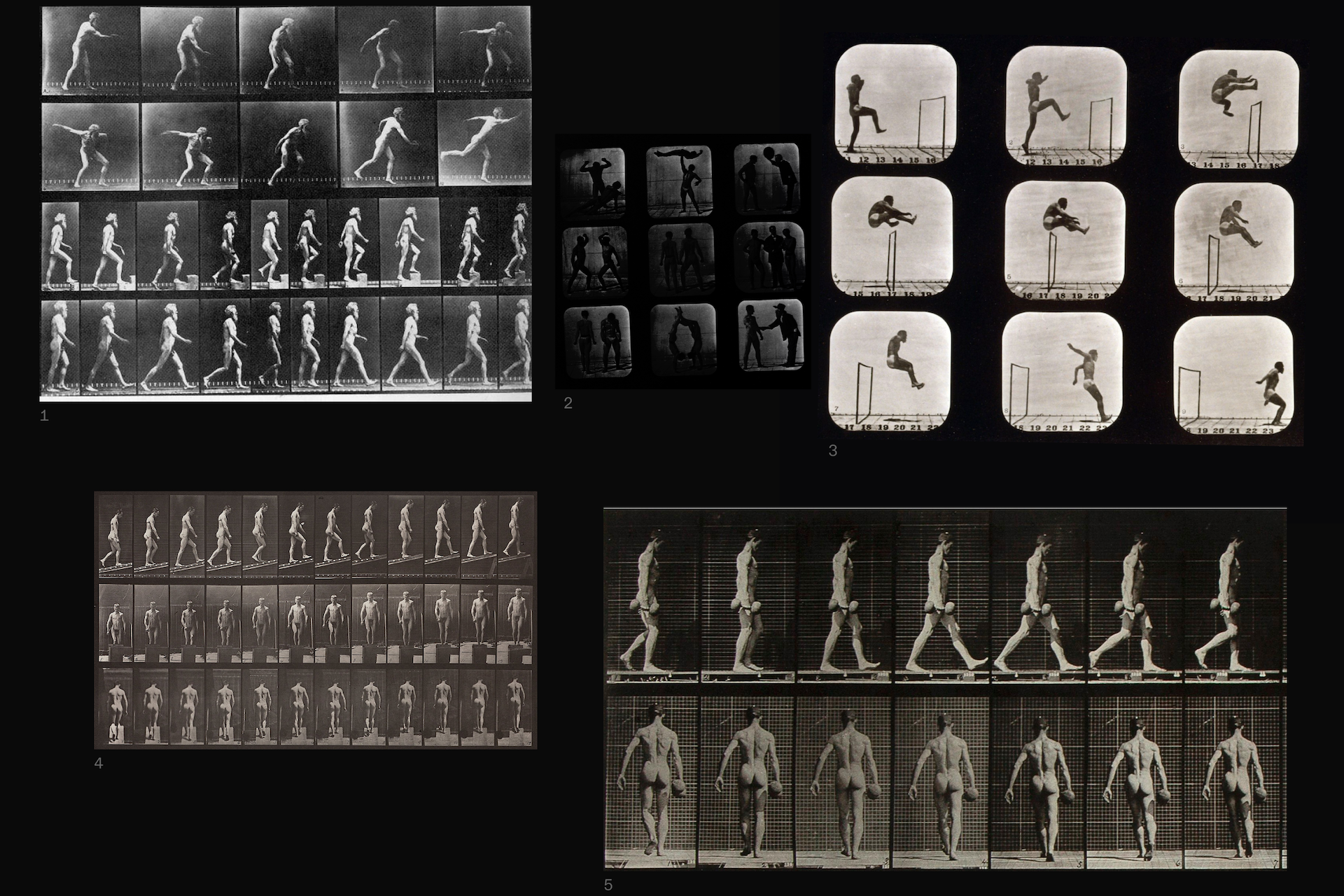
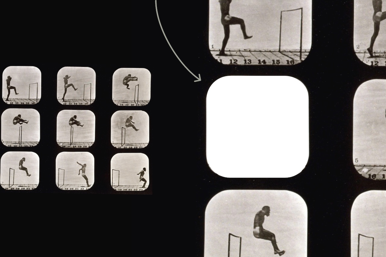
So far, we've covered the work of Gerstner and his inspiration for our brand name, approach and use of typography; but we've yet to cover our second key reference. As mentioned, Programme is a movement company and our use of movement is a fundamental pillar to our offering. With the importance of this subject, we looked back to the works of Eadweard Muybridge and his famous studies of motion. Muybridge used modern technology to capture the first photographs of movement dating back to 1877. These comprehensive studies stand as a key influence to what we're doing at Programme, and to pay homage to this work we used these images to guide our brand's compositional elements, instilling a rich history into our visual language.

Brand elements are just tools for communicating a message (like your brand's values), and like any tool they should be simple to use. Take a logo as an example, they gain value over time through consistent usage. They hold, or store that value if they're able to successfully communicate a message through recognisability and past marketing efforts.
Shape and grid became compositional design tools when reviewing the work of Eadweard Muybridge. In his earliest works, Muybridge left the classic film negative frame visible in his compositions. These shapes respresent frames of movement – a simple idea that can be used to visually articulate human movement. We also leverage the grids found throughout Muybridge's work to present these frames creating a consistent design language, making composition a useful tool to communicate our message.
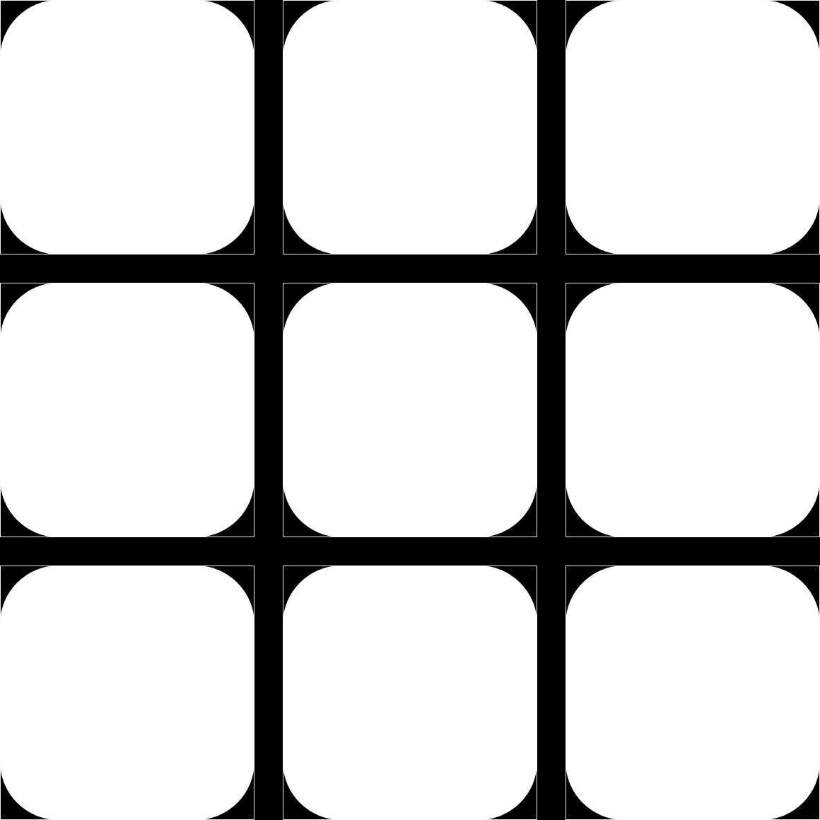
Composition as Shape
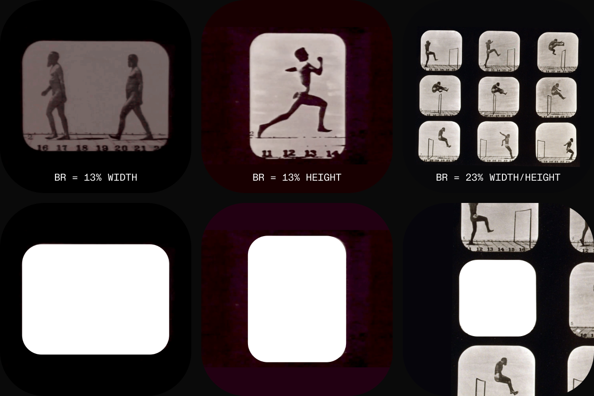
Composition as Grid
Programme as Word
Ofcourse, we would use Gerstner-Programm inspired Diatype to express our brands wordmark, pulling straight from the cover of Programme entwerfen (Designing Programmes) itself.
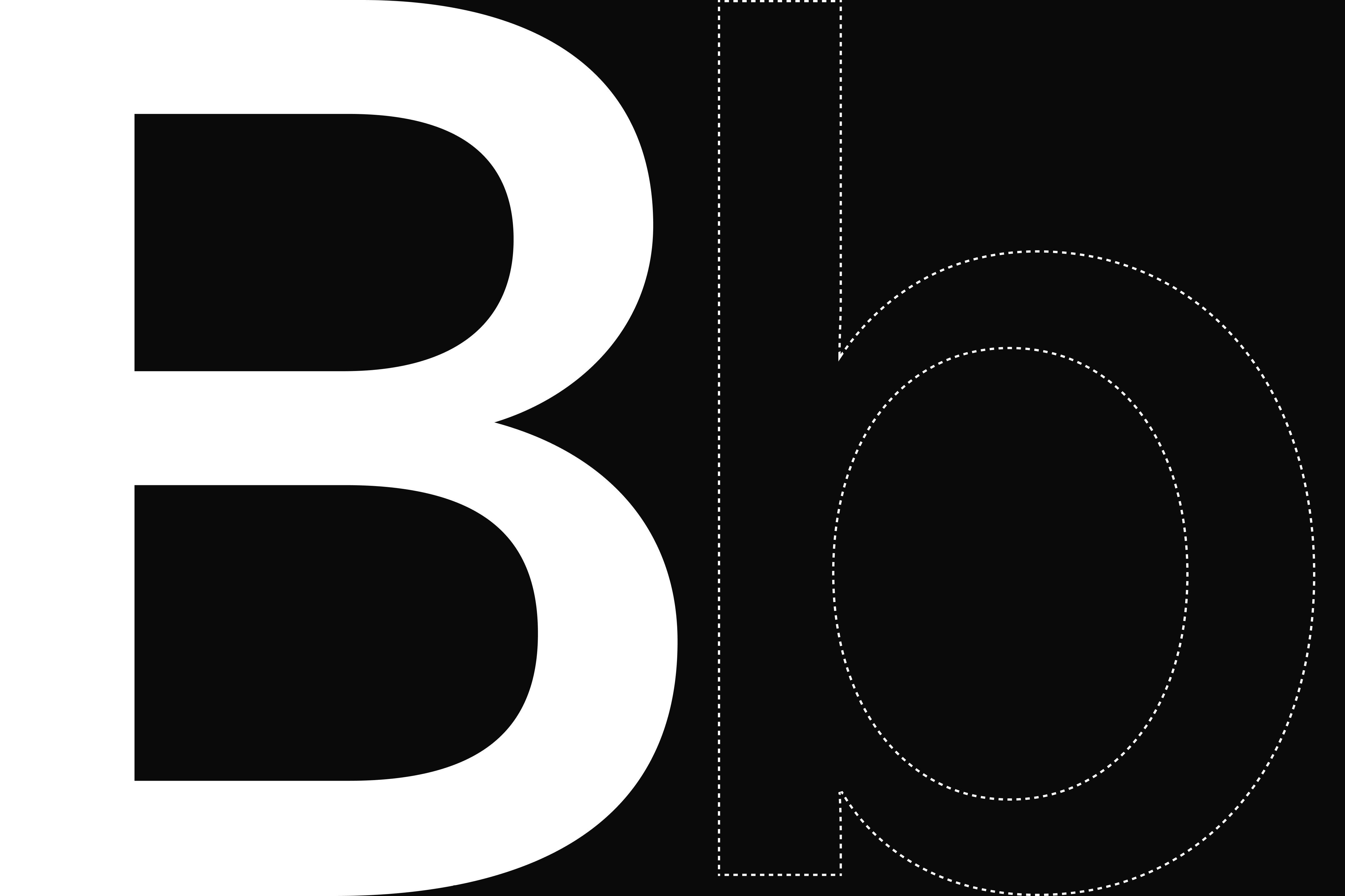
Programme as Mark
Our product is the marriage of our curation of movements and our programme. When creating our mark we wanted it to have these elements instilled within it, while creating something that's recognisable, simple, beautiful and aligns with the other elements in our brand system.
Our composition represents our study of movement, so we use this element as the first building block for our mark.
To express the idea of a system or programme with the mark I looked to Gerstner's grid discussed in Designing Programmes, initially developed for the german economics magazine – Capital.
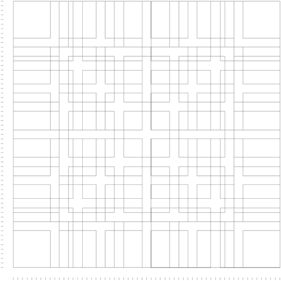
In the same way our product places movement within our system, we placed the Muybridge frames within Gerstner's grid system to create the structure of our mark. From here we simply removed a selection of frames to create the shape of a "P" and place the final mark back within the system to create balanced padding in our products app icon and on our social icons.
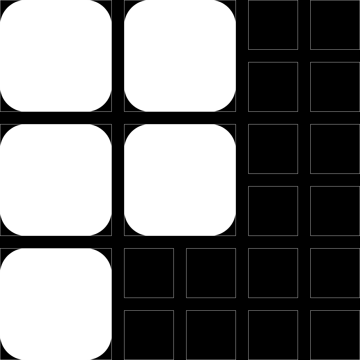
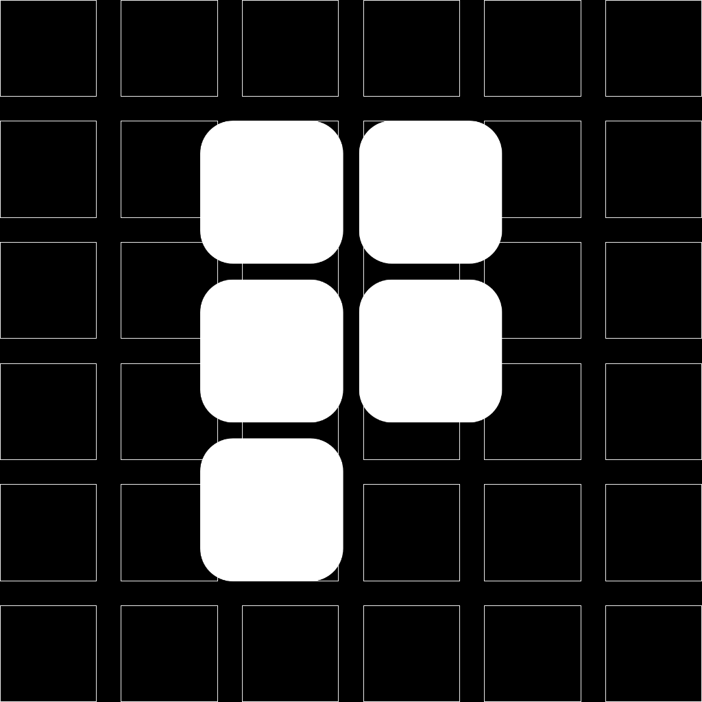


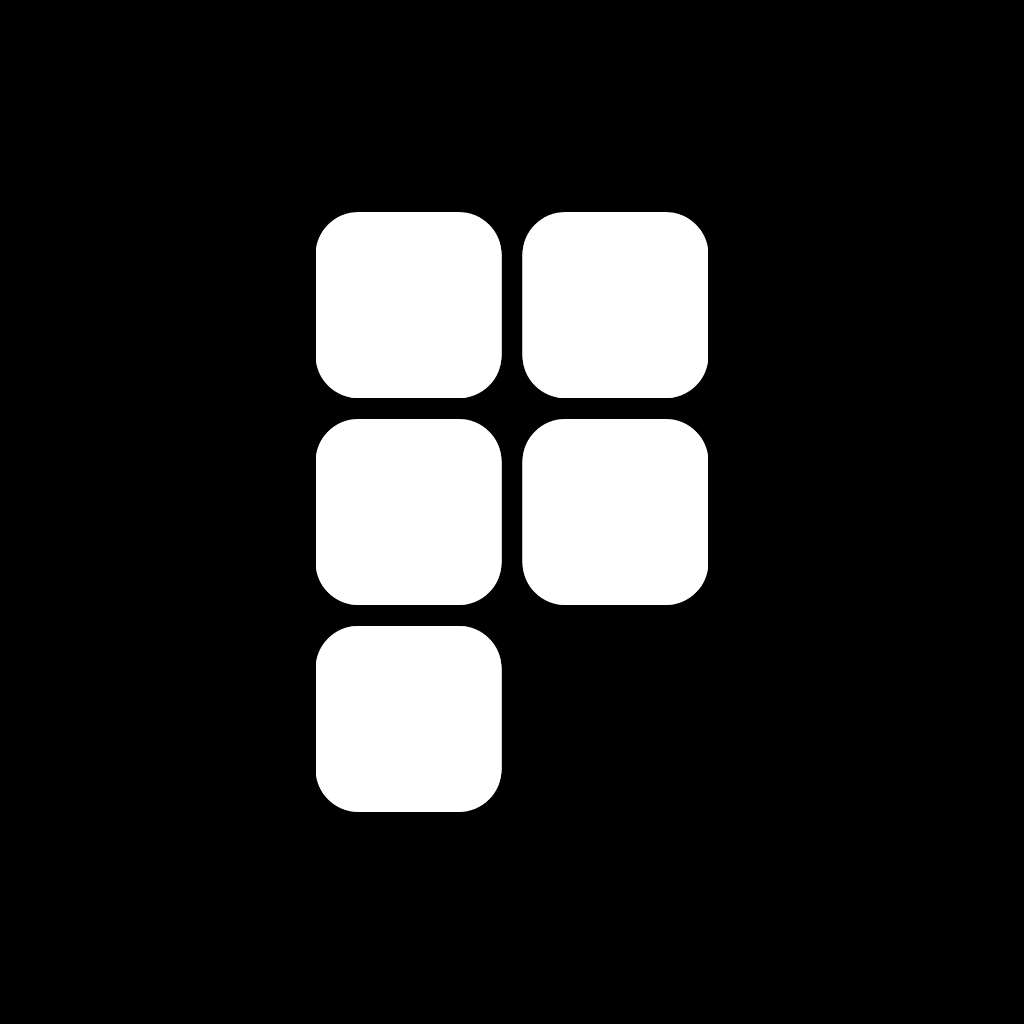
We use this as white on black to resemble the negative space of the frames of movement.
Programme as Logo
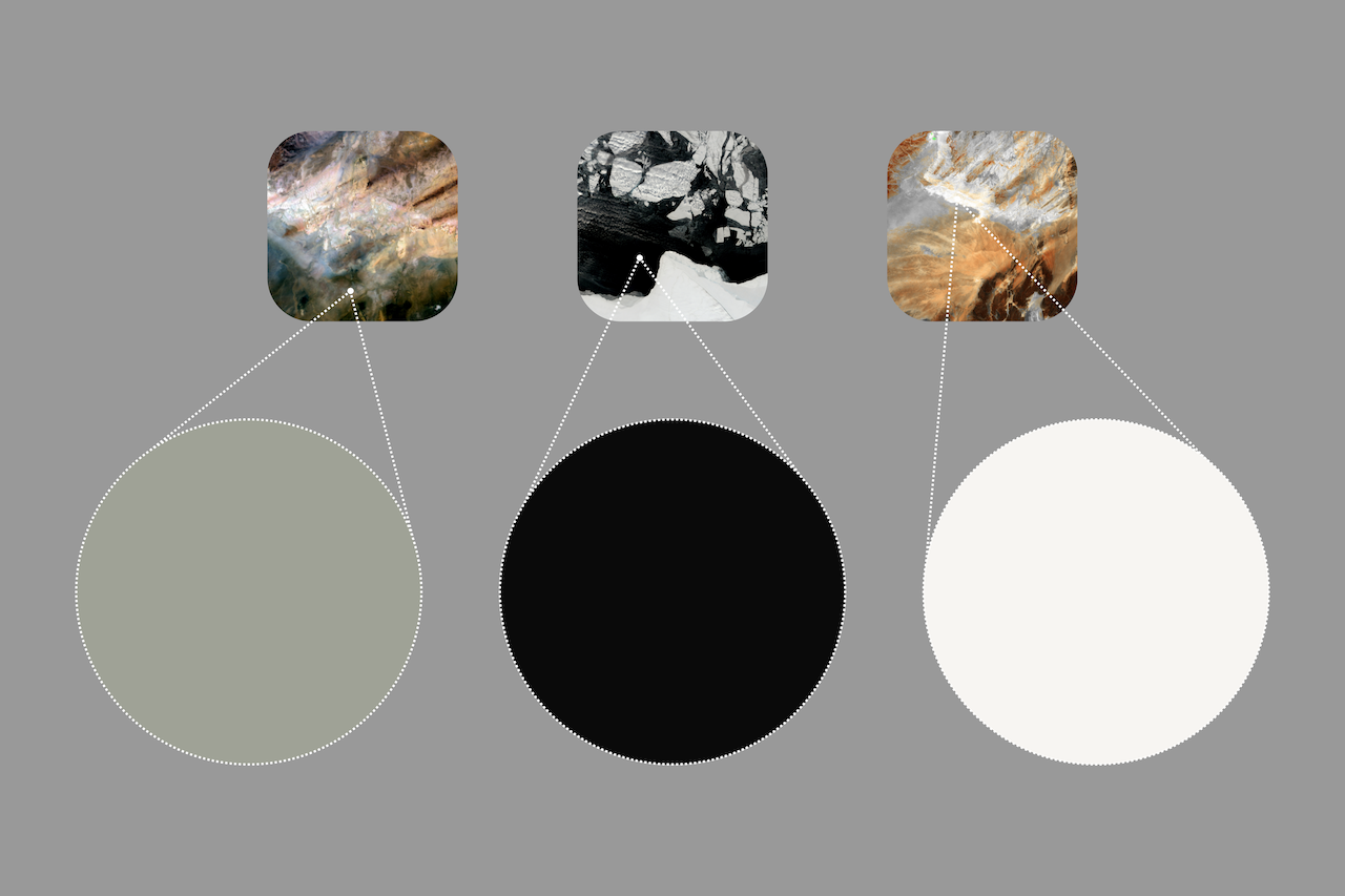
Color
While we rely on contrast between black and white for accessible communication, we use shades of natural tones throughout our app's experience to create a sense of ease and calm.
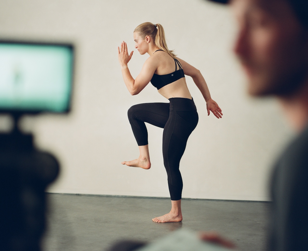
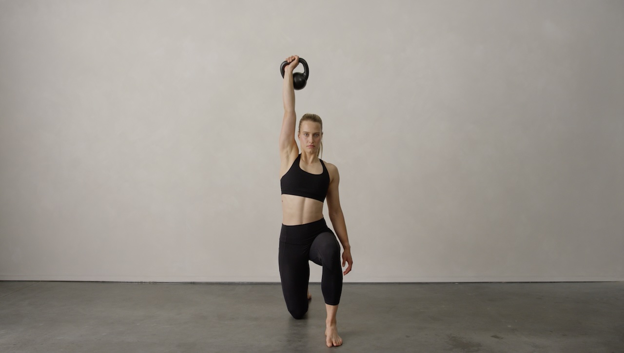
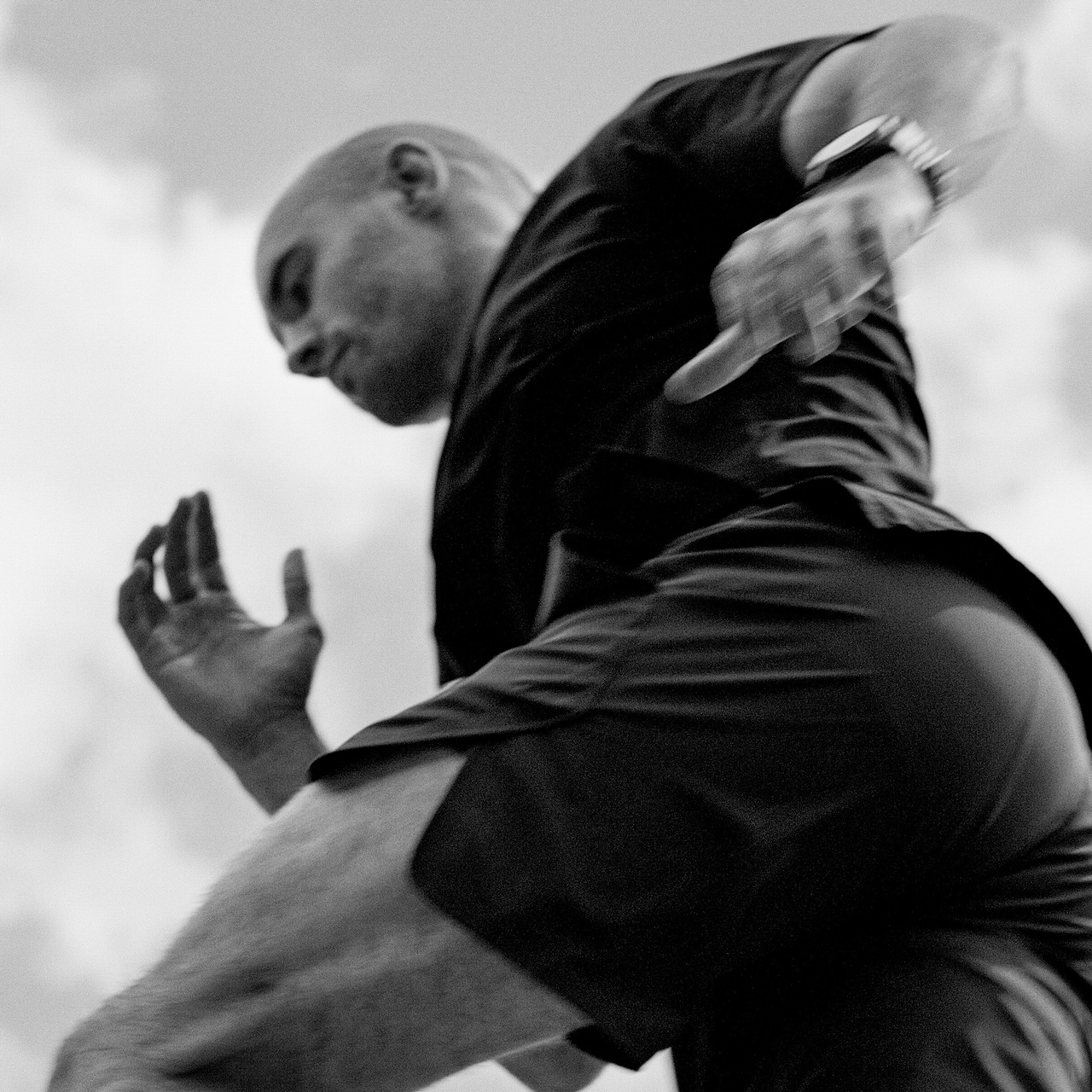
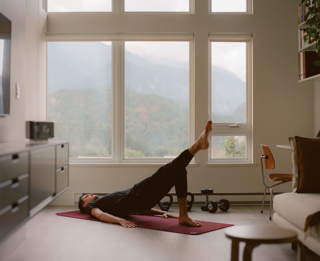
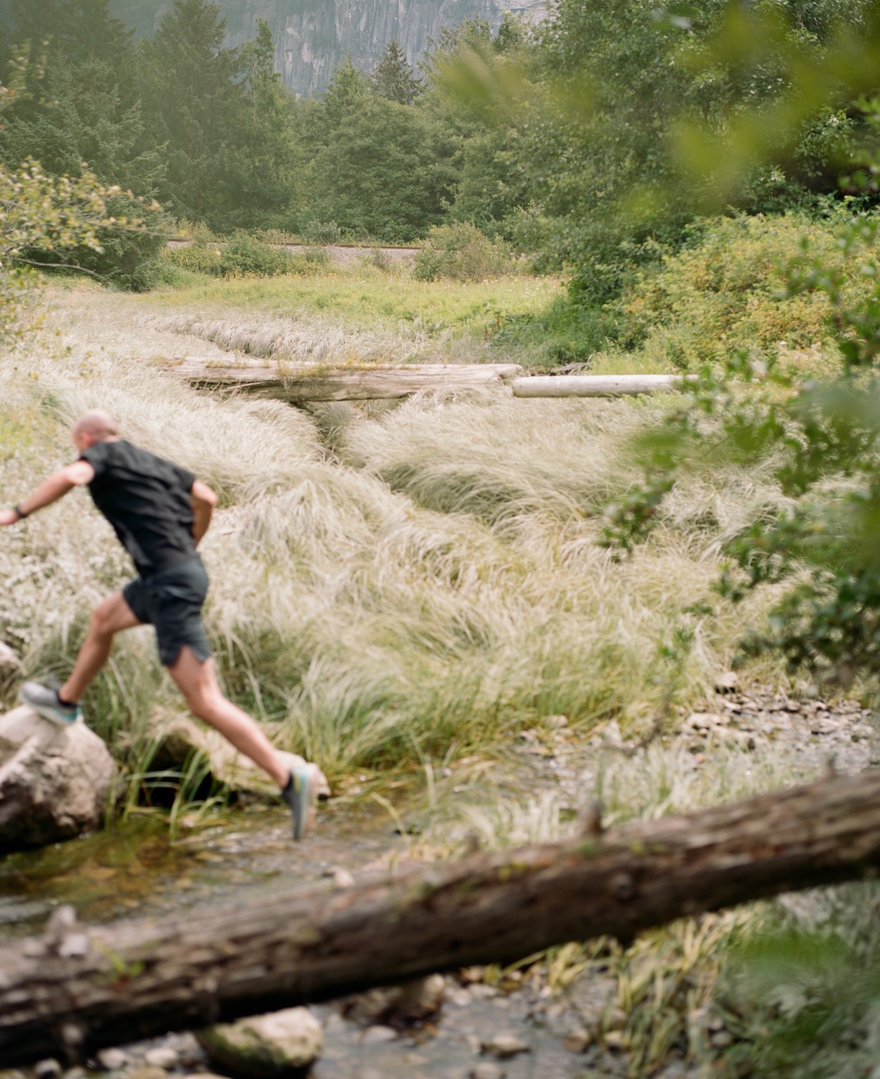
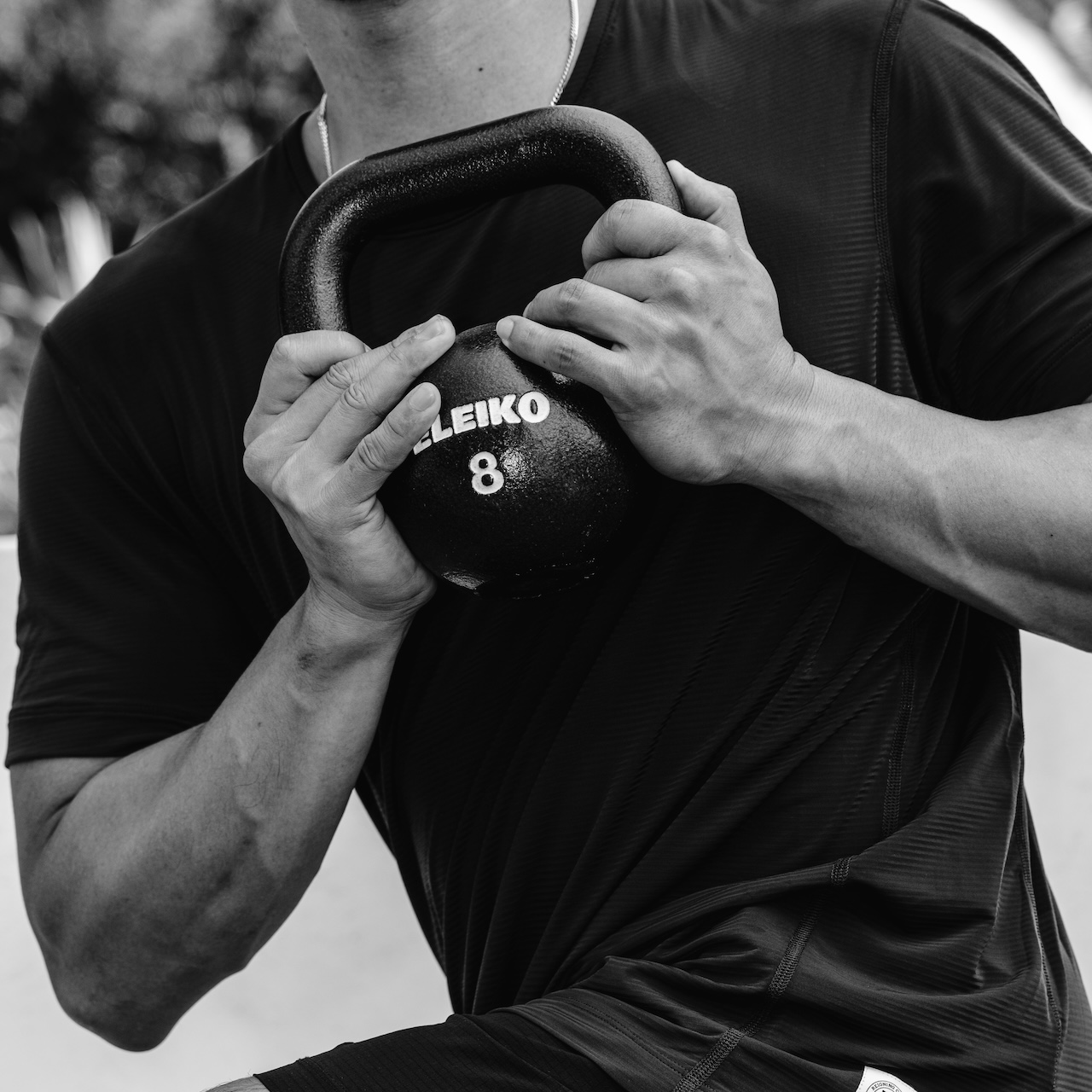
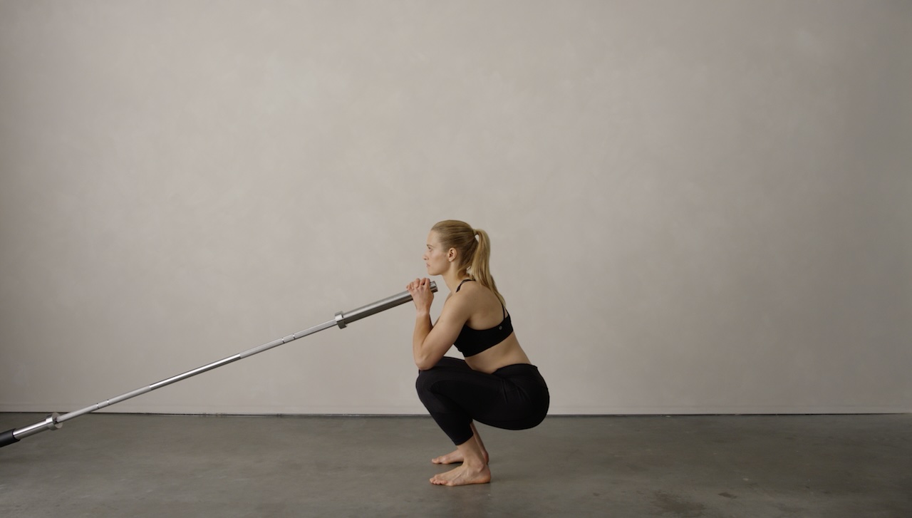
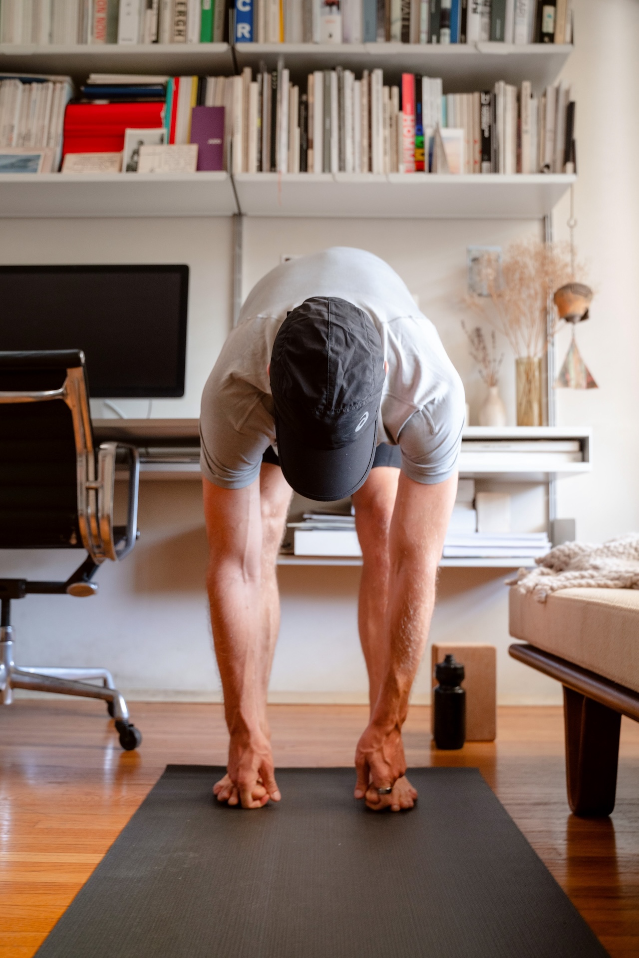
Photography
Our photography aims to inspire people to move again. We present movement in action and beauty to showcase a lifestyle made accessible through physical empowerment.
Moving Forward
A brand system is proven valuable through its usage, to express our story & message. If you've made it this far, thank you for reading. If you've been a while since you moved, here's a quote from Socrates that might change that:
"No citizen has a right to be an amateur in the matter of physical training… what a disgrace it is for a man to grow old without ever seeing the beauty and strength of which his body is capable." – Socrates
And more importantly to us:
"Surely a person of sense would submit to anything, like exercise, so as to obtain a well functioning mind and a pleasant, happy life" – Socrates
This document was written by Oliver Thomas Klein at the time of developing Programme's brand identity. We believe it serves as insight into the brand's history and purpose, but more importantly, the brand's ethos.